Ptite_Perle
A les clefs du forum
Je tiens le trousseau de clefs du forum
Fondatrice Messages : 5859 Venue : 27/06/2009 Je suis :  Age : Age : 60 Je vie à : Lyon Humeur : Bonne humeur Mes Points : 120741 | Menu tout en rondeur | | Coucou Voici comment faire un menu avec des ronds. Tu peux changer les couleurs, via le CSS Pour mon exemple j'ai mit le code dans la page d'accueil , aprés à toi de voir ou tu veux l'installer, sur ton forum ou site web.
HTML: - Code:
-
<a class="css3dbutton" href="#"><span class="outer"><span class="top">SYMPA!</span><span class="bottom">Trop bien</span></span></a> <a class="css3dbutton blue" href="#"><span class="outer"><span class="top">SYMPA!!</span><span class="bottom">bien bien</span></span></a> <a class="css3dbutton pink" href="#"><span class="outer"><span class="top">SYMPA!</span><span class="bottom">Commentaire</span></span></a> <a class="css3dbutton yellow" href="#"><span class="outer"><span class="top">SYMPA!</span><span class="bottom">Un lien</span></span></a> CSS: - Code:
-
a.css3dbutton {
background: #c1e75c; /* default green background color of button */
color: black;
text-decoration: none;
font: bold 18px Arial; /* font size and style */
position: relative;
display: inline-block;
margin-right: 15px; /* spacing between multiple buttons */
padding: 15px; /* padding inside button */
border-radius: 85px; /* border radius of button */
width: 85px; /* dimensions of button */
height: 85px;
outline: none;
box-shadow: 0 8px 0 #8dab3b, /* depth and color of main shadow */
0 0 3px rgba(0,0,0, 0.2),
0 20px 20px #eee;
-moz-transition: all 0.2s ease-in-out; /* transition style and duration */
-o-transition: all 0.2s ease-in-out;
-webkit-transition: all 0.2s ease-in-out;
transition: all 0.2s ease-in-out;
}
a.css3dbutton span.outer{ /* outermost text container */
text-align: center;
width: 100%;
display: block;
position: relative;
top: 50%; /* center element */
-webkit-transform: translateY(-50%); /* center element */
-ms-transform: translateY(-50%);
-moz-transform: translateY(-50%);
transform: translateY(-50%);
}
a.css3dbutton span.outer span.top{ /* top line */
display: block;
padding-bottom: 4px;
}
a.css3dbutton span.outer span.bottom{ /* bottom line */
border-top: 1px solid black;
padding-top: 4px;
display: block;
text-transform: uppercase;
line-height: 12px;
font-size: 60%;
}
a.css3dbutton:hover {
background: #9cc62b; /* background color when mouse rolls over button */
box-shadow: none;
-ms-transform: translateY(8px); /* shift button downwards by shadow depth amount */
-webkit-transform: translate3D(0, 8px, 0);
-moz-transform: translateY(8px);
transform: translate3D(0, 8px, 0);
}
a.css3dbutton.blue{
background: #a6e9f7;
box-shadow: 0 8px 0 #529dad, /* depth and color of main shadow */
0 0 3px rgba(0,0,0, 0.2),
0 20px 20px #eee;
}
a.css3dbutton.blue:hover {
background: #66cbe1; /* background color when mouse rolls over button */
box-shadow: none;
}
a.css3dbutton.pink{
background: #fbbaba;
box-shadow: 0 8px 0 #d74848, /* depth and color of main shadow */
0 0 3px rgba(0,0,0, 0.2),
0 20px 20px #eee;
}
a.css3dbutton.pink:hover {
background: #ea6161; /* background color when mouse rolls over button */
box-shadow: none;
}
a.css3dbutton.yellow{
background: #f3fa86;
box-shadow: 0 8px 0 #dbcd2f, /* depth and color of main shadow */
0 0 3px rgba(0,0,0, 0.2),
0 20px 20px #eee;
}
a.css3dbutton.yellow:hover {
background: #ecd347; /* background color when mouse rolls over button */
box-shadow: none;
}
.vcentercontainer{
position: relative;
top: 50%;
transform: translateY(-50%);
} |
| |
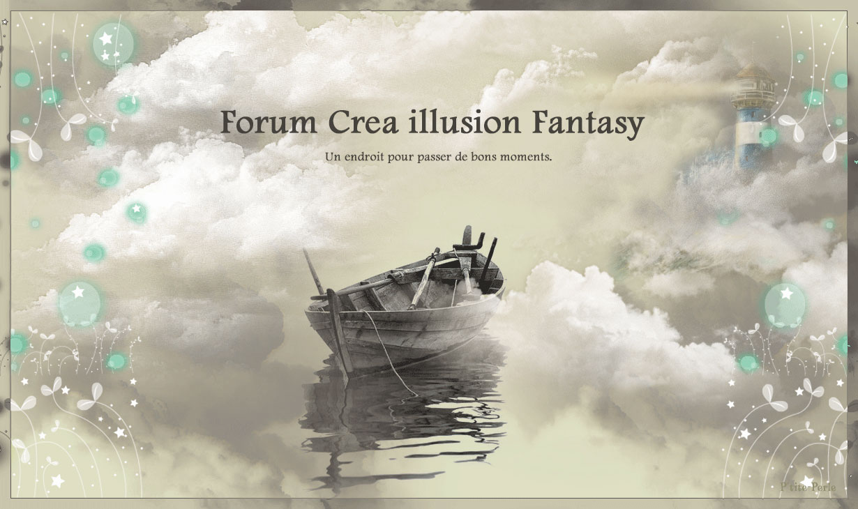
 Accueil
